

Client
Civil Service
Type of project
Rebrand
What I did
Concept creation, logo design and animation, asset designs, guidelines
Brief
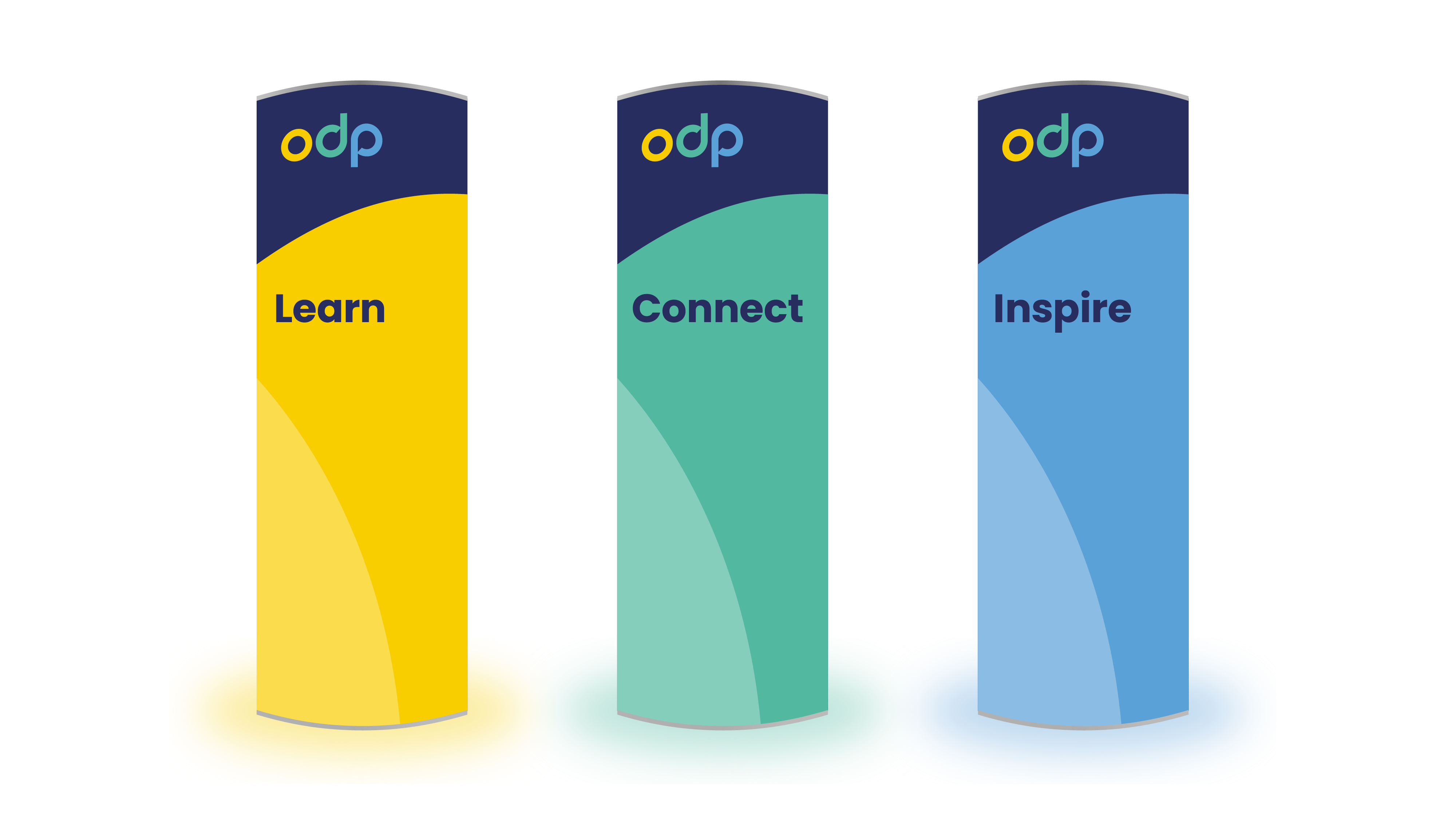
The ODP supports civil servants who run front line services such as processing passports, managing prisons and securing borders. They tasked us with creating a new brand for them which was more sophisticated and accessible than their previous one, while still standing out amongst the government crowd. The logo needed to include three colours, to represent each of their key values.
Solution
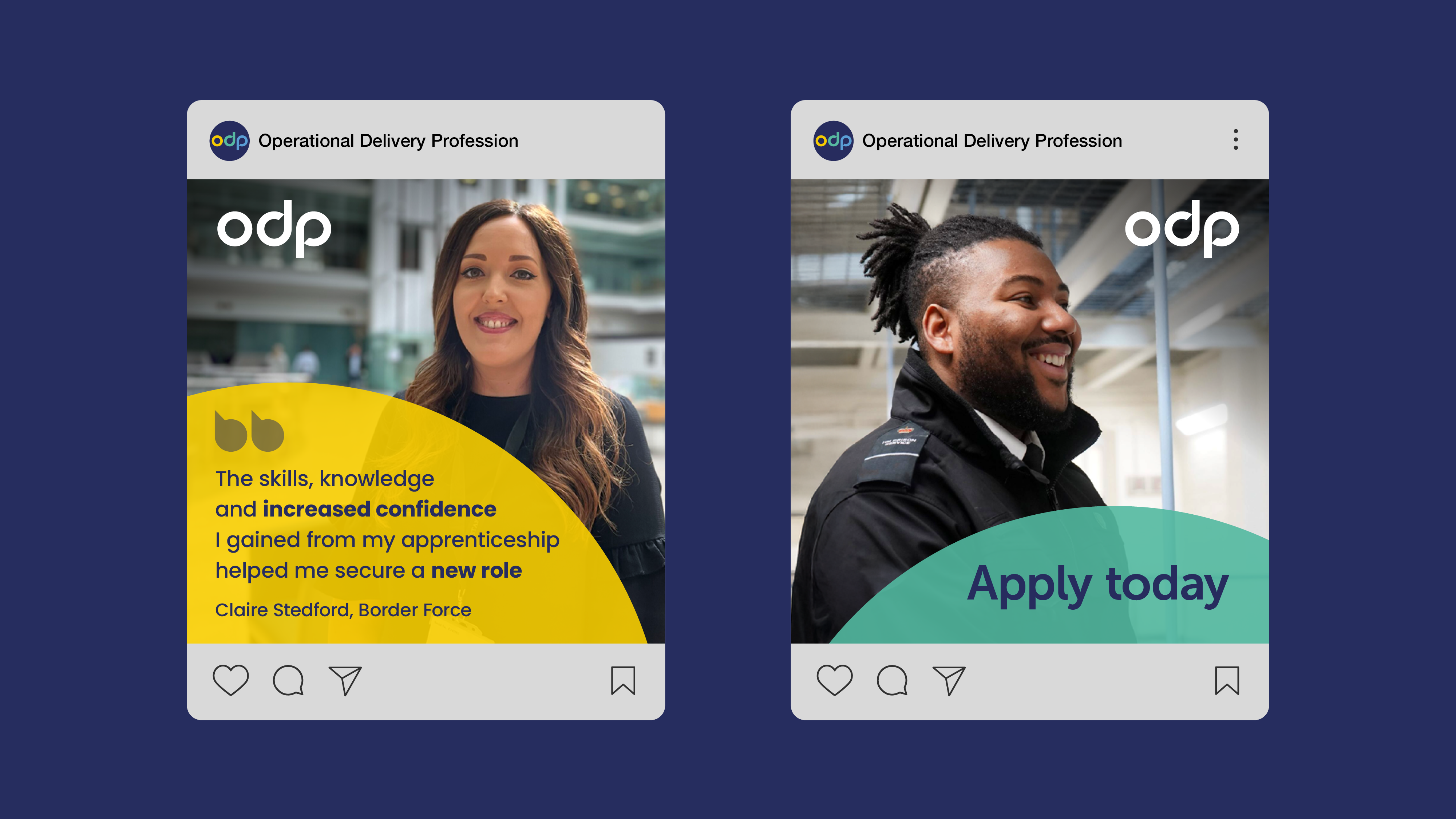
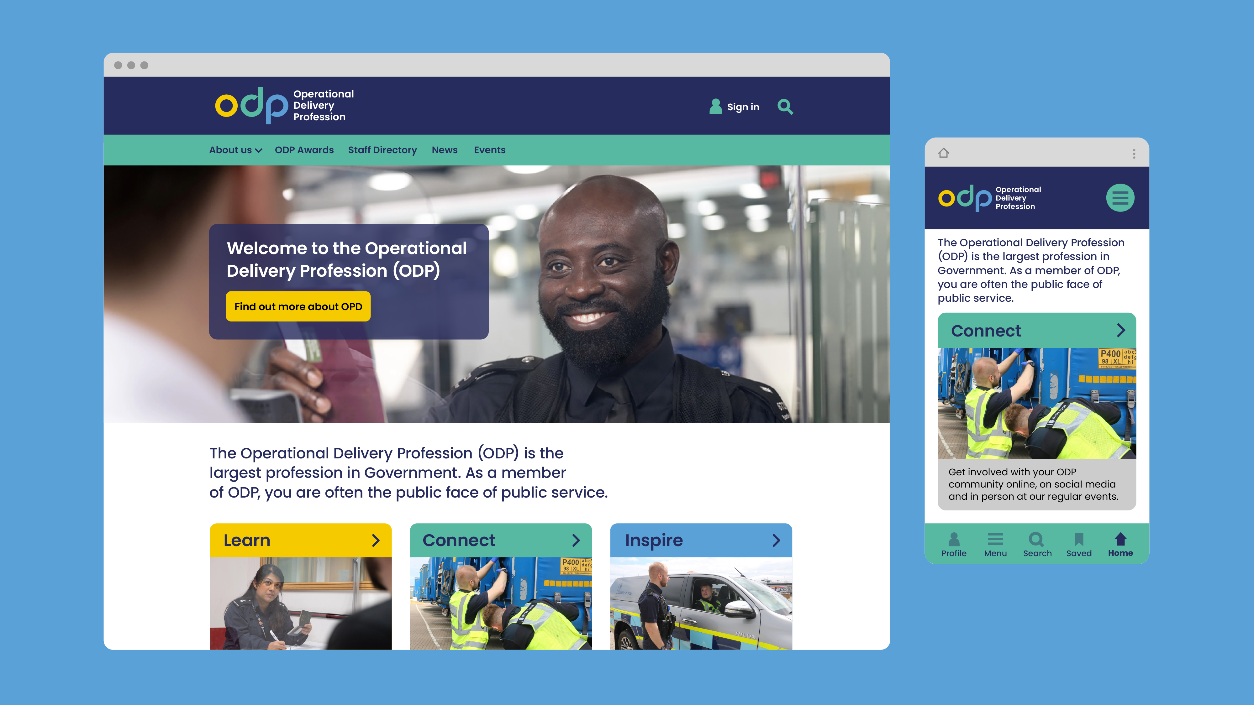
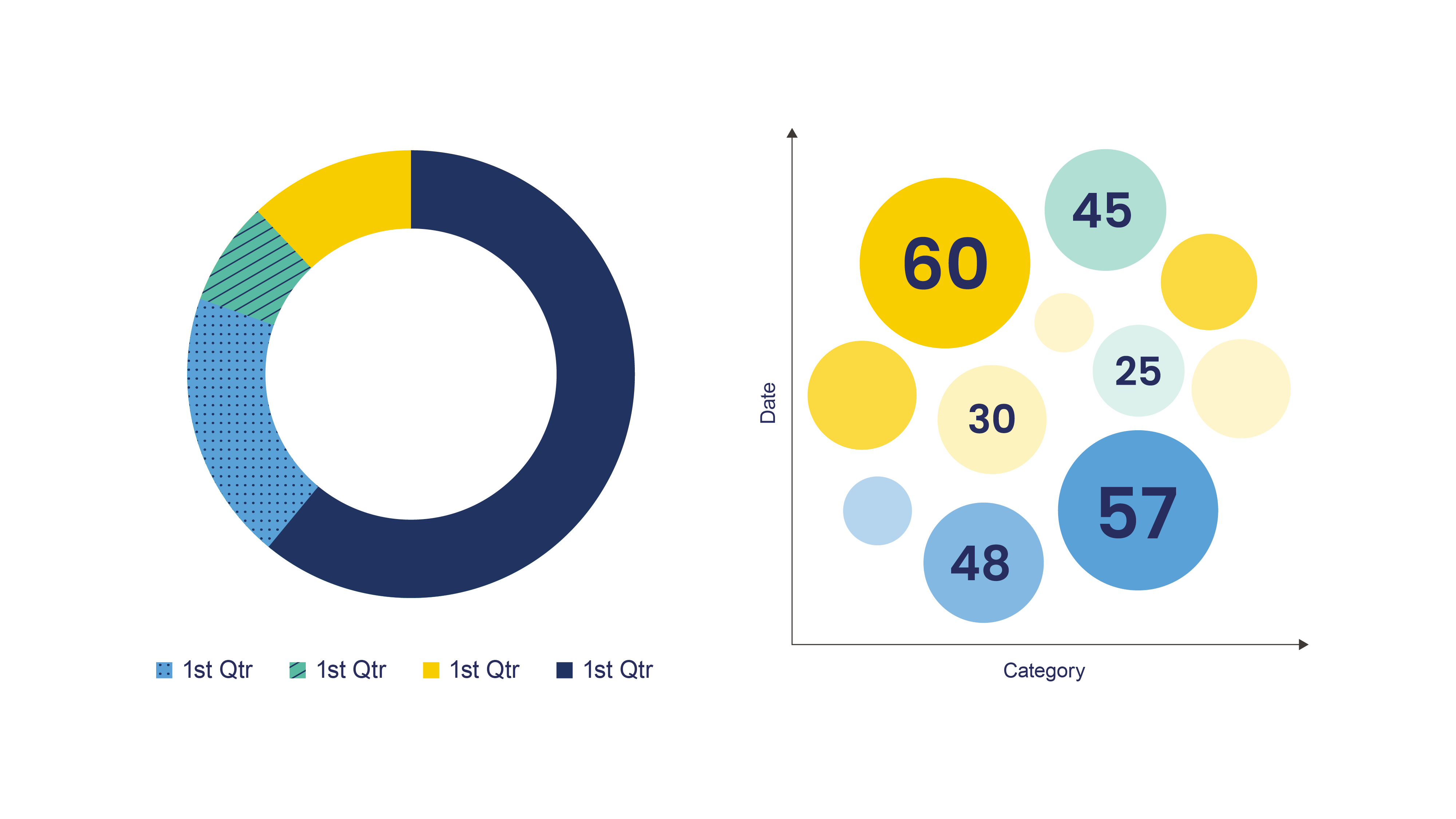
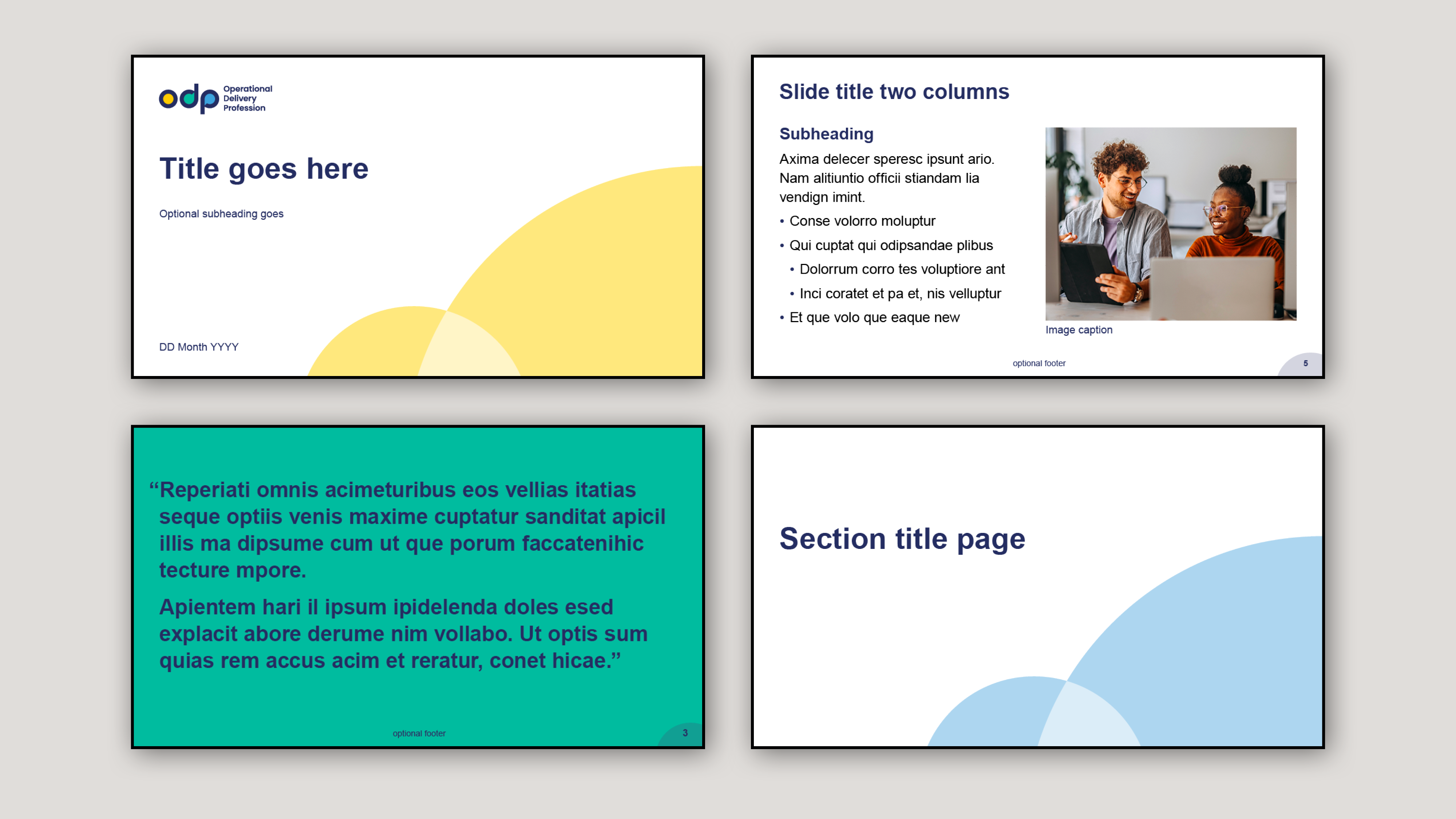
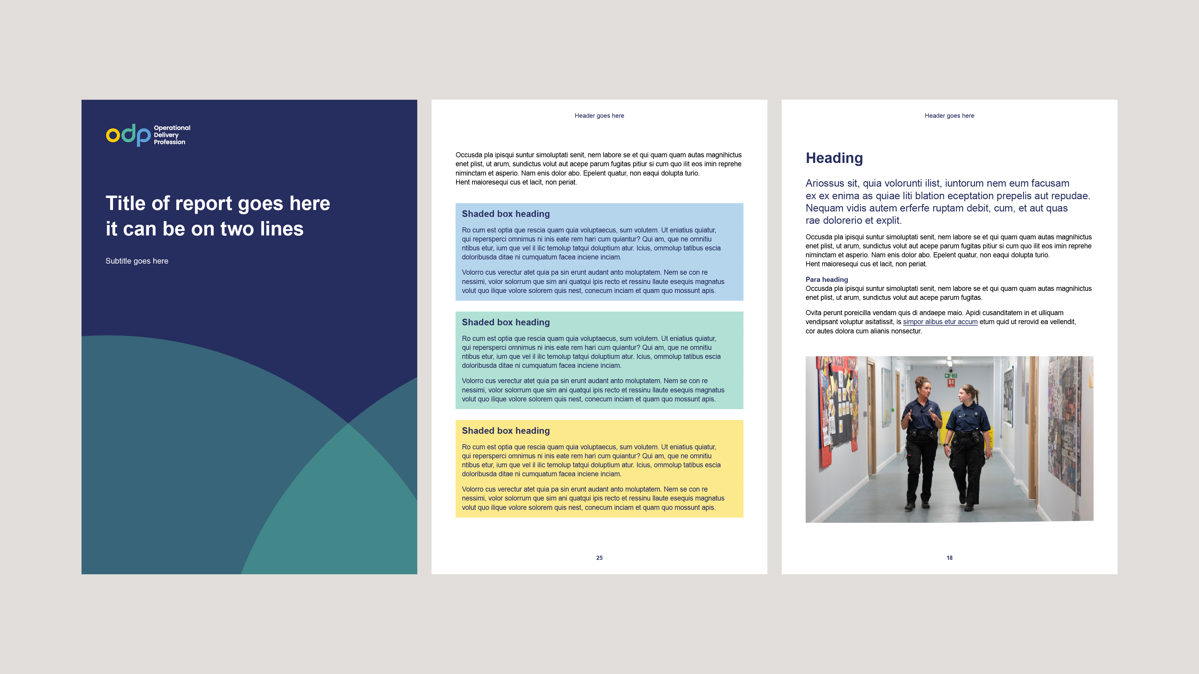
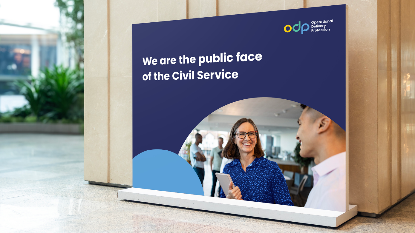
I referenced the role ODP play in communicating directly with the public by adding subtle speech bubbles to their acronym, within the counters of the ‘d’ and ‘p’. The circular lowercase letterforms feel approachable and balanced, and are complimented with a similarly rounded brand font. I used circles as a graphic device throughout the identity, and chose vibrant yet soft colours for the palette, pared with a reassuringly professional navy blue. Photography also plays a big role, reflecting the audience by showing a diverse range of people.
