

Client
Department for Energy Security and Net Zero
Type of project
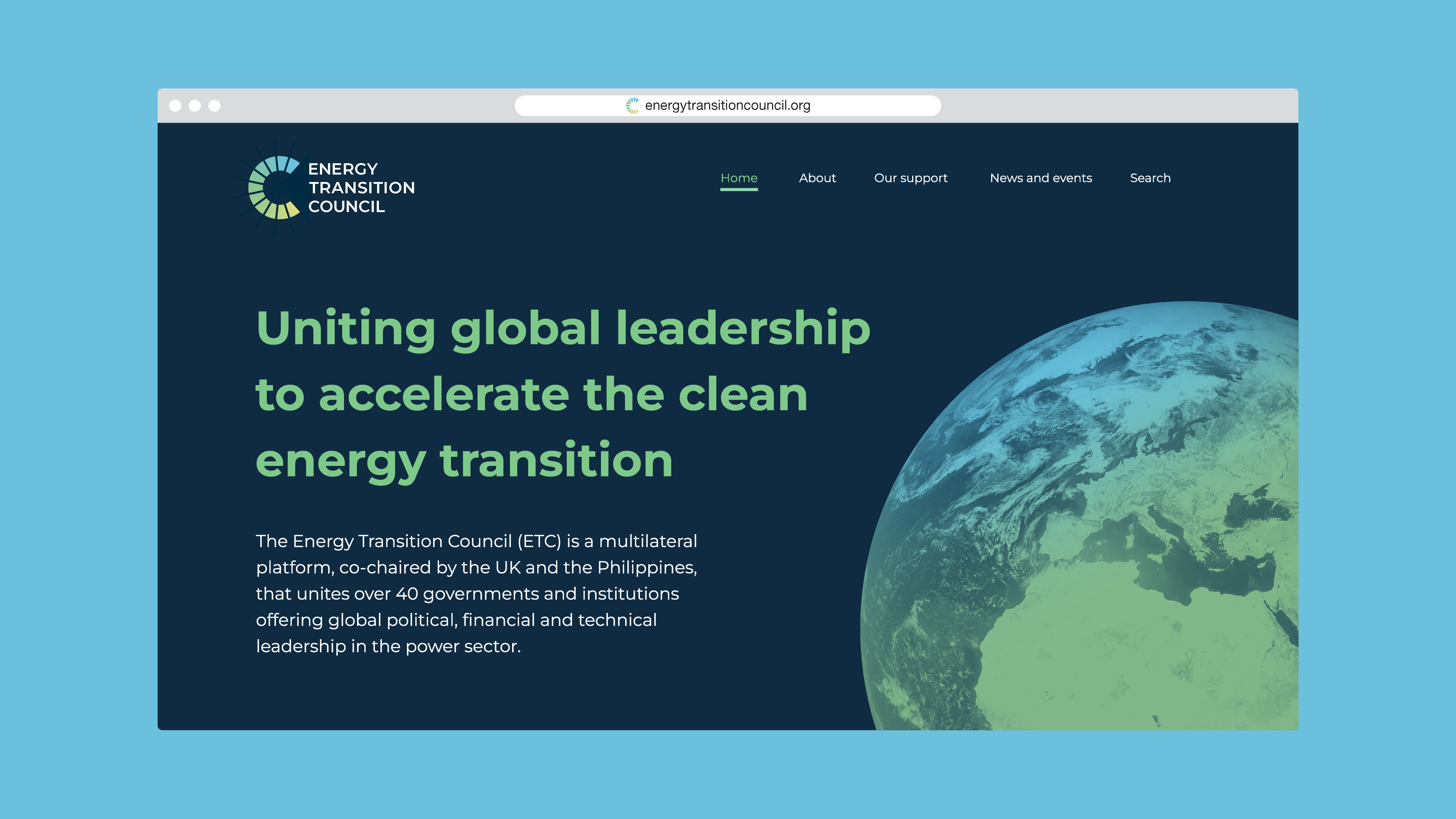
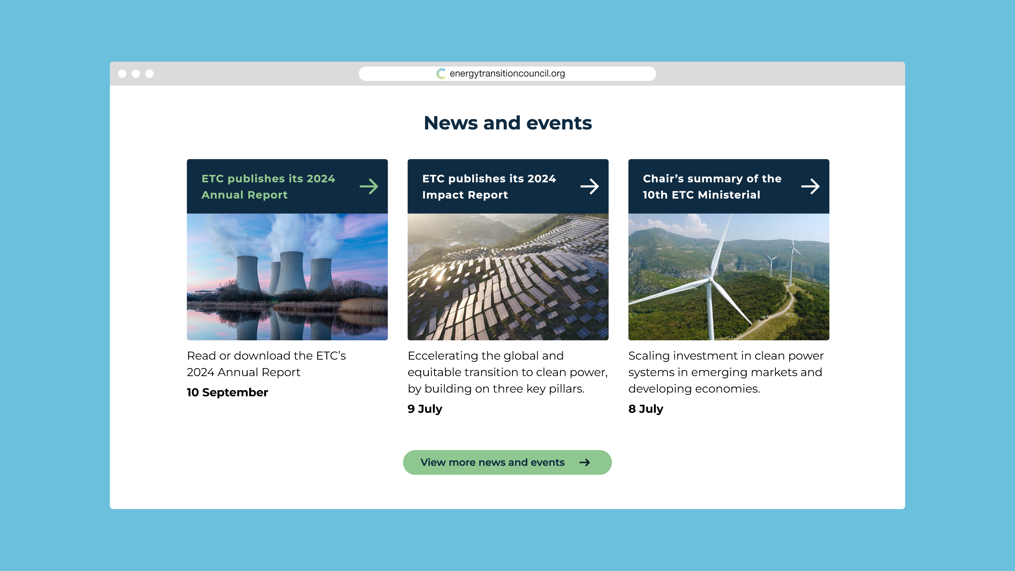
Branding, logo and website design
What I did
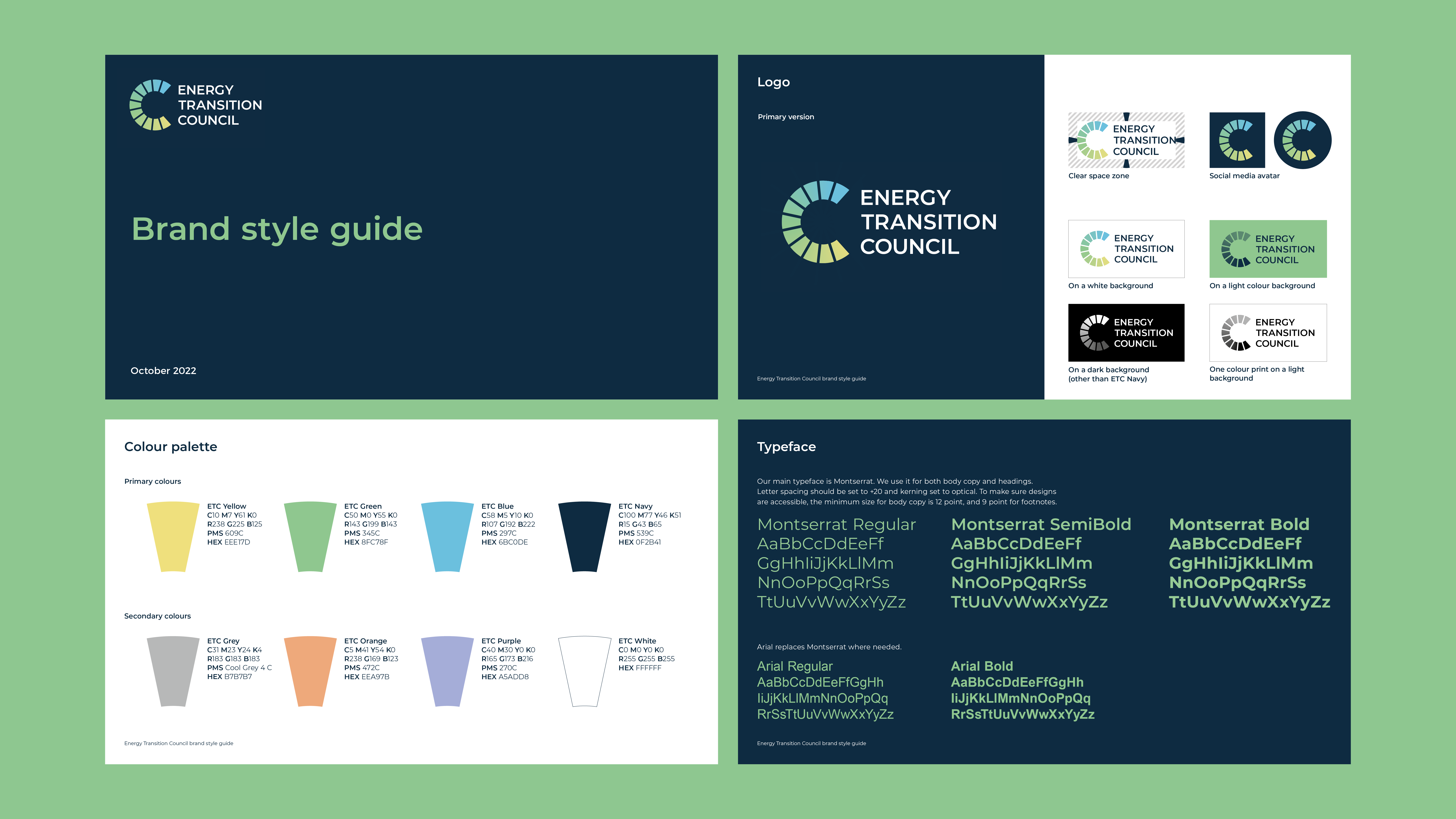
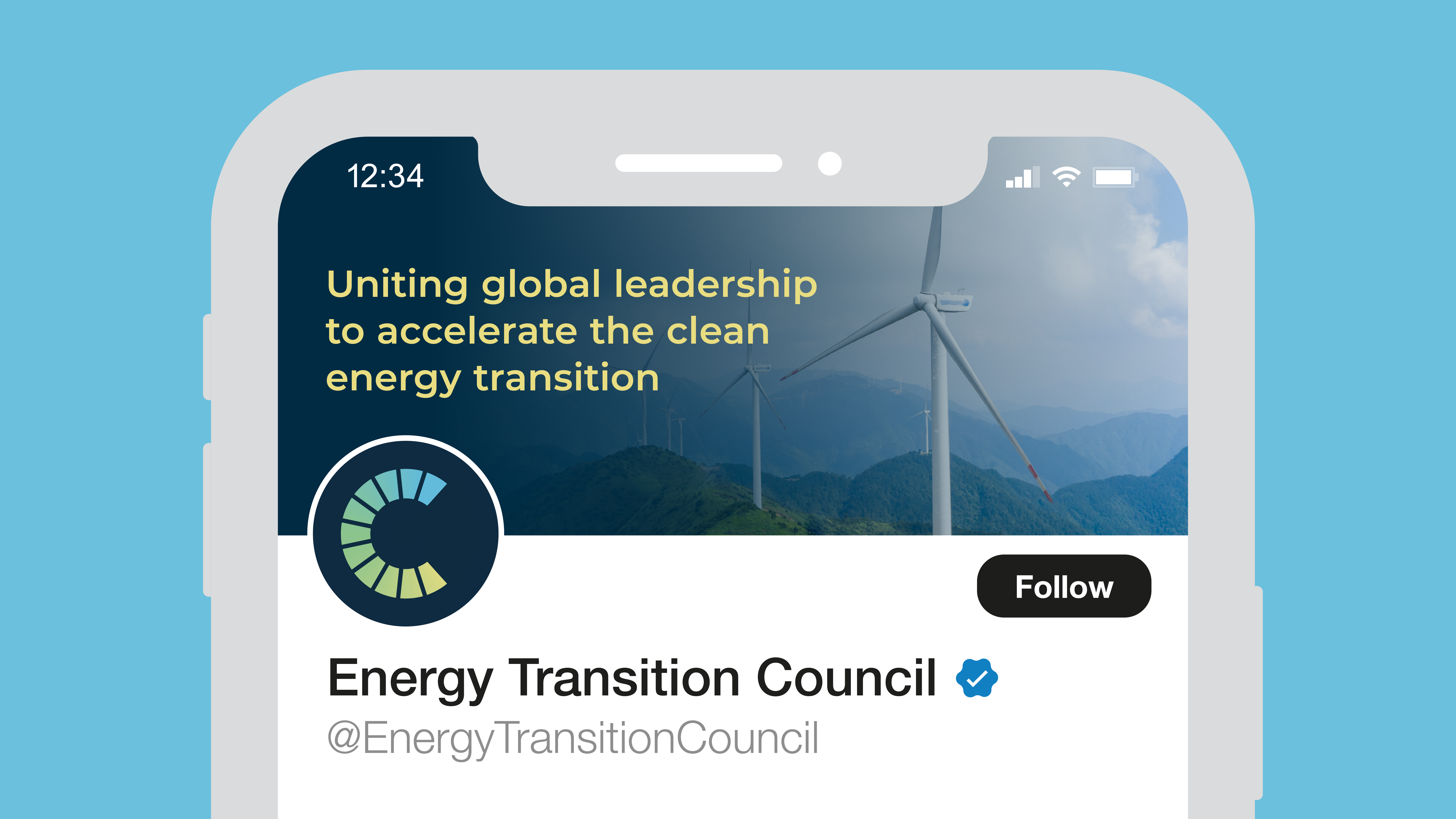
Concept creation, logo design and animation, web design, asset designs, guidelines
Brief
The Energy Transition Council (ETC) unites over 40 governments and institutions
to accelerate the clean energy transition. They wanted to improve global recognition
with a logo and brand identity that clearly communicated their purpose, while being
unique and easily recognisable.
Solution
The symbol in the logo is made up of segments coming together, representing the
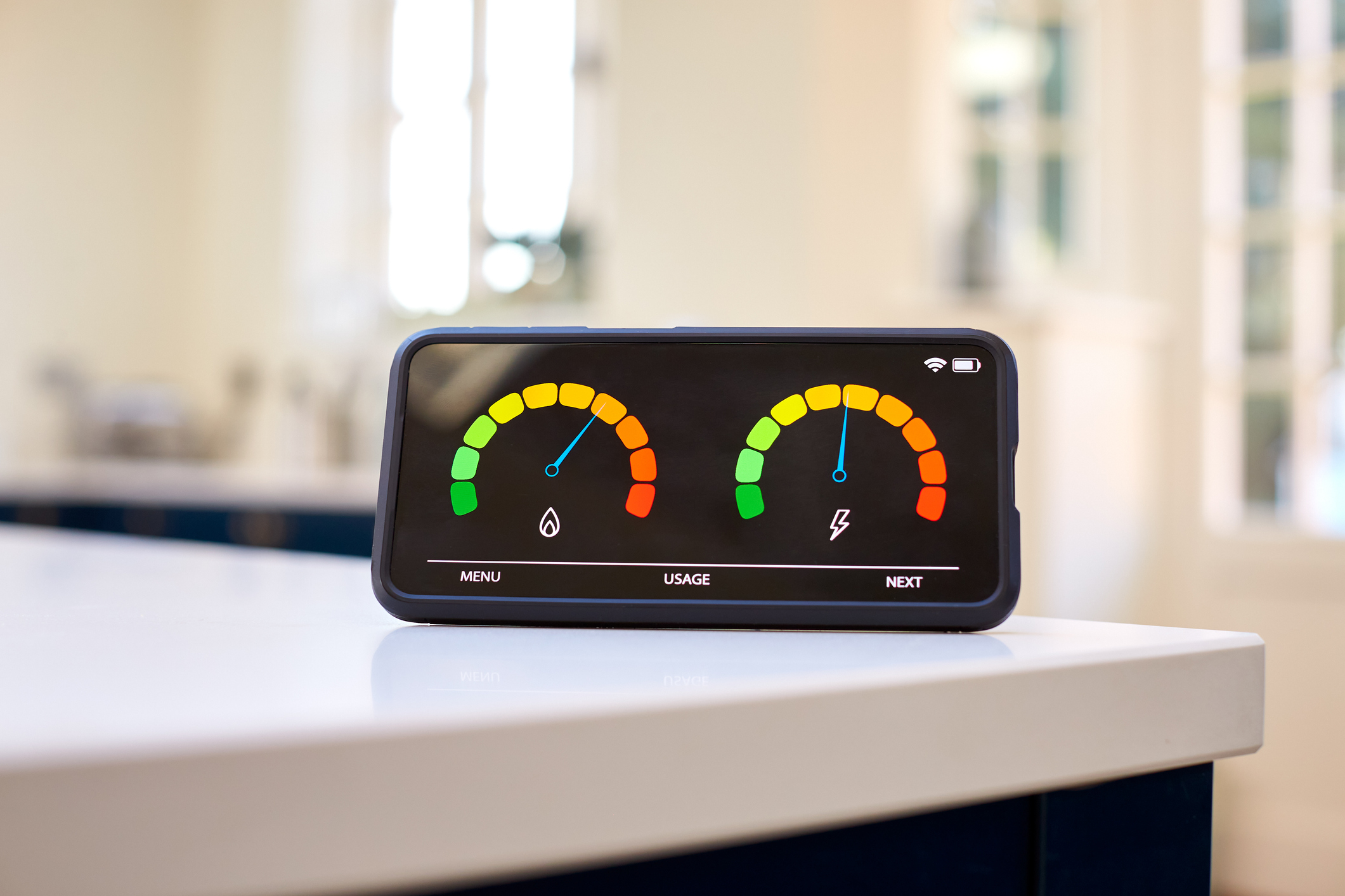
uniting of multiple organisations, and forms a ‘C’ for council. The shape also draws inspiration from council chamber layouts – often arranged in a semi-circle – and from smart meter dials. The use of gradients in the symbol, image overlays and icon style, signals transition, with a brand palette made up of fresh and uplifting, yet gentle, earth inspired colours. A clean, modern font was chosen for the wordmark, featuring rounded letterforms, that echo the symbol’s shape, and set in uppercase to add gravitas.