Client
Aromatherapy Associates
Type of project
Packaging and branding
What I did
Packing rollout and asset design
Brief
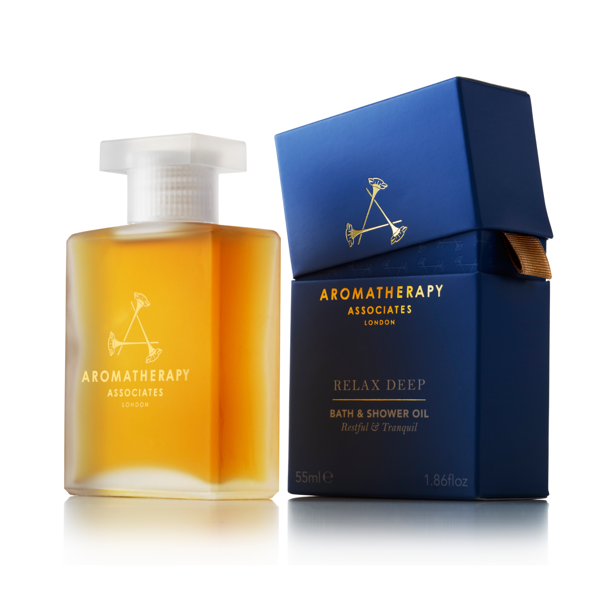
Aromatherpy Associates have been the leading experts within aromatherapy for over 30 years. They wanted to re-fresh their outdated identity so that they could attract more high-endretailers and spas to stock their products. They also wanted to increase consistency across their range as well as ease navigation.
Solution
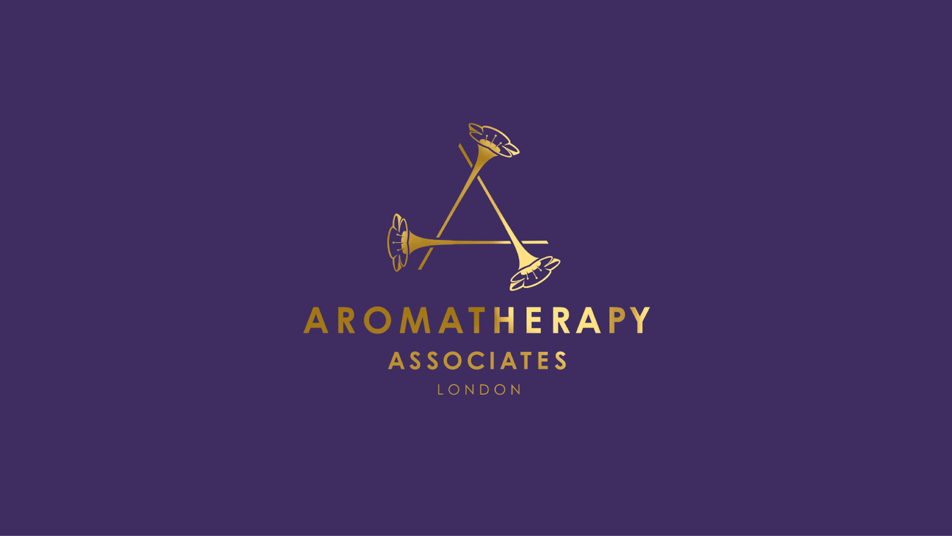
The new marque consists of three elongated flowers perfectly arranged to form the initial ‘A’. They overlap to form an exact equalateral triangle, suggesting balance of mind and body, as well as harmonious blends of ingredients. We gave the brand its own hero colours: a vibrant purple paired with sumptuous gold. But we also considered the architecture and differentiation of the range, using colour to help consumers navigate between the different Skincare and Mind & Body products.